Ugly on Purpose: How Janky Design Became the Realest Flex in the Room

There is a Tumblr post — grainy, misaligned, typed in Comic Sans over a JPEG so compressed it looks like it was run through a blender — that has more cultural weight right now than anything Adobe Illustrator has ever produced. Nobody is asking who made it. Nobody cares. The fact that it looks like it was assembled by a sleep-deprived thirteen-year-old in 2007 is not the problem. That is the point.
Welcome to the Ugly Era. Population: everyone who's sick of things looking too good.
The Tyranny of Clean Lines
For roughly a decade, Silicon Valley handed us a visual language and told us it was the future. Sans-serif fonts. Negative space. Muted palettes that all somehow looked like the inside of a Scandinavian dentist's office. Apple made it aspirational. Instagram made it compulsory. And somewhere around 2019, a generation of people raised on dial-up buffering screens and DeviantArt watermarks collectively looked at all that pristine white space and thought: this is a lie.
Polished design, it turns out, carries a smell. And that smell is corporate. It's focus-grouped. It's the visual equivalent of someone saying "we're like a family here" during a job interview. The cleaner something looks, the more invisible hands have touched it — lawyers, brand consultants, a committee of stakeholders who agreed that teal was "approachable but not threatening." Gen Z, raised on the raw unfiltered chaos of early YouTube and MySpace profile pages that could induce seizures, has an extremely finely tuned detector for that kind of sanitized phoniness.
So they blew it up. Lovingly, deliberately, with great aesthetic intention.
The Craft of Not Caring (Which Takes a Lot of Craft)
Here's the thing nobody wants to admit about the janky aesthetic: it's genuinely hard to do well. Slapping a bad font on something doesn't make it resonate. Throwing a pixelated filter over your photo doesn't automatically make it feel authentic. The difference between something that reads as "broken on purpose" and something that just looks like a mistake is nearly impossible to articulate and completely impossible to fake once you've seen both.
The best practitioners of lo-fi visual culture — and yes, there are practitioners, and yes, some of them are making real money — understand the grammar of ugliness. They know which artifacts feel nostalgic versus which ones just feel cheap. They know that a GIF with visible dithering hits differently than a GIF that's merely low-resolution. They are, in the most unironic sense possible, masters of a craft that they would absolutely die before calling a craft.
Look at the zine resurgence. Or the way Canva templates that deliberately mimic xeroxed flyers from 1994 have become a dominant visual language on TikTok. Or the entire aesthetic ecosystem of "weird little guy" illustration — lumpy, off-model, drawn with what appears to be a mouse in Microsoft Paint — that now moves merchandise faster than most professional design studios. None of this happened by accident. It happened because someone made an intentional choice to communicate something that slick design physically cannot: I am not performing for you.
Distortion as a Credibility Signal
There's a sociological concept at work here that's worth naming. In economics, Thorstein Veblen described how the wealthy signal status through conspicuous waste — buying things that are more expensive than necessary, just to prove they can. What Gen Z has done with aesthetics is something like the inverse: conspicuous refusal. The deliberate choice to use worse tools, lower resolution, cruder execution — not because you can't afford better, but because choosing better would mean caring about the wrong things.
A brand with a perfectly kerned logo is a brand that spent money impressing you. A zine with a crooked staple and a typo on page three is a zine that spent energy telling you something. The medium is the message, and the message is: the content mattered more than the container.
This is why the aesthetic translates so powerfully to political and social content. Protest graphics that look handmade — even when they're digital — carry a weight that a polished infographic simply cannot. Mutual aid flyers that look photocopied communicate urgency and grassroots legitimacy in a way that a Squarespace template never could. Ugliness, deployed correctly, is a form of trust-building.
The Nostalgia Feedback Loop
There's also a deeply personal dimension to this that gets overlooked when people frame it purely as aesthetic rebellion. For a lot of people in their early-to-mid twenties, the visual language of bad design is the visual language of before — before algorithms curated their personalities, before engagement metrics told them what was worth making, before the internet became a place where you had to be good at it to participate.
The early web was genuinely ugly. GeoCities pages were visual catastrophes. Neopets customization was an act of pure chaotic expression. And in that ugliness, there was an almost utopian sense of permission. You didn't need skills. You didn't need a brand. You just needed something to say and the audacity to say it in blinking text on a tiled background of tiny flames.
Recreating that visual texture now isn't just nostalgia for a specific era — it's nostalgia for a specific feeling of the internet. One where participation didn't require professionalism. One where the barrier to entry was zero and the aesthetic standard was whatever you felt like.
Glitch as Gospel
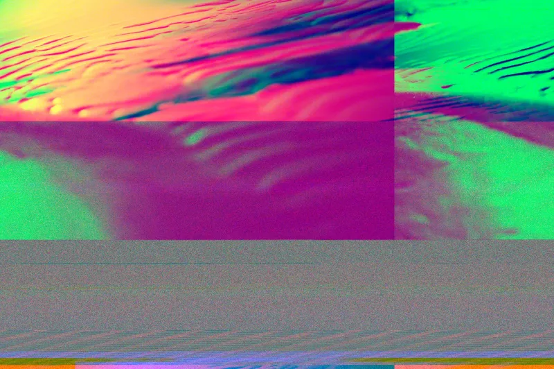
What makes the ugly aesthetic genuinely interesting — and genuinely difficult for corporations to co-opt successfully — is that it's fundamentally about sincerity. Every time a major brand tries to slap a distressed filter on their ad campaign or commission a "lo-fi" version of their logo, it collapses under the weight of its own contradiction. You cannot perform authenticity with a marketing budget. The glitch only works when the glitch is real.
And that's the actual cultural argument being made by every poorly kerned flyer, every over-compressed JPEG, every deliberately terrible font choice that's lighting up corners of the internet right now. It's not that beauty is bad. It's that beauty without meaning is worse than ugliness with it.
The pixelated, the distorted, the deliberately janky — these aren't failures of design. They're a refusal to let design get in the way of the thing design is supposed to serve.
Sometimes the most radical thing you can do is make something ugly and mean every pixel of it.